Claude x Figma MCP (The Good and the Bad)

By Rob M.

I’ve been exploring AI-assisted design workflows for a while now, testing tools like Claude Code, Figma Make, and GitHub Copilot to see where they fit into design system work. Recently, I tested something different: using Claude Desktop with a Figma MCP (Model Context Protocol) to control Figma directly through conversation. No code editor in the middle, no exporting and reimporting. Just me talking to Claude while it manipulated my component library in real time.

The results were messy at first. Then they got interesting. Here’s what happened.

The Setup

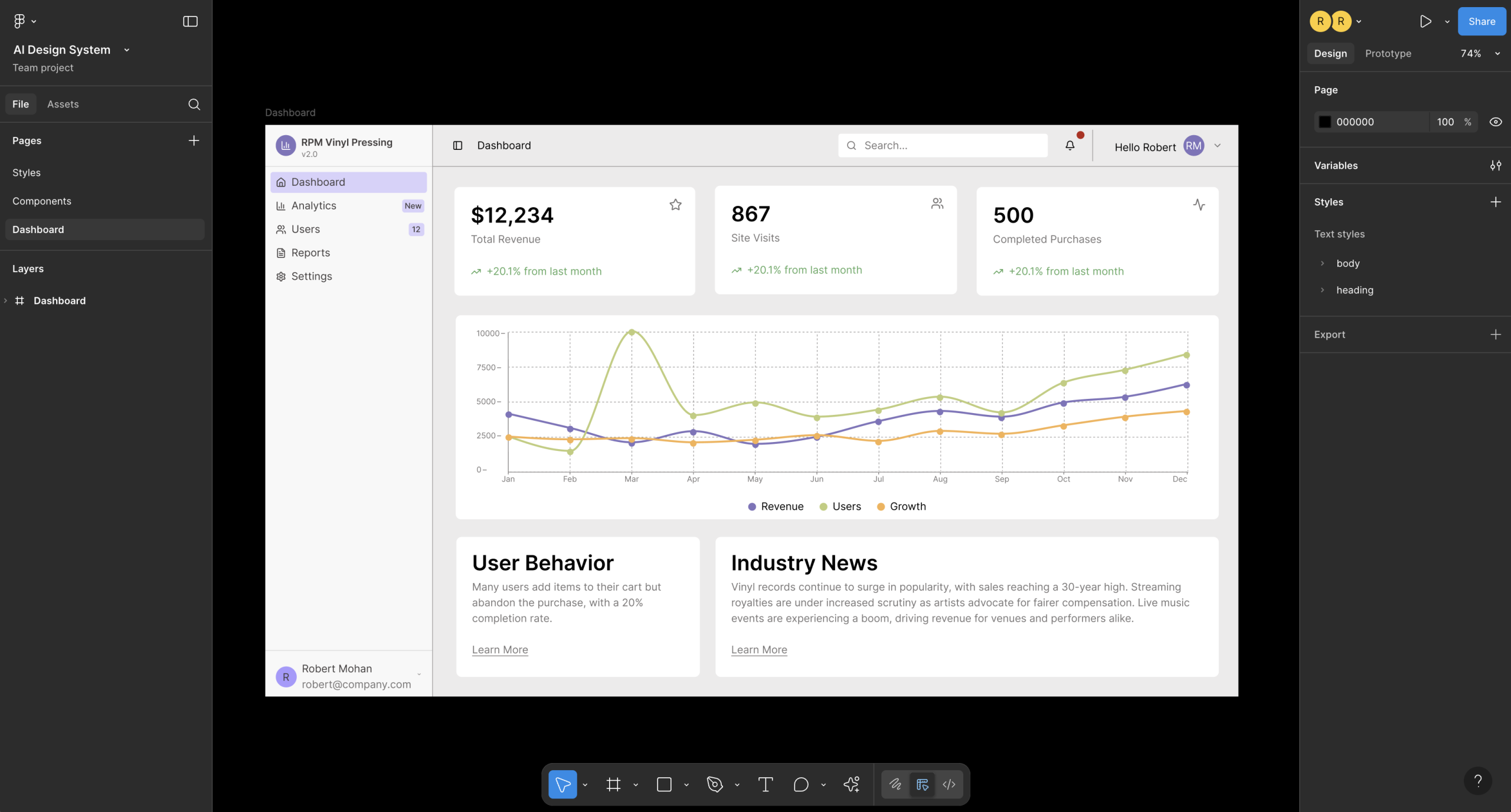
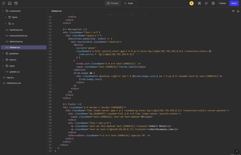
The tool I used is called Claude Talk to Figma MCP, a community-built plugin that connects Claude Desktop to Figma through a WebSocket bridge. The architecture is straightforward: Claude sends commands through an MCP server, which routes them through a WebSocket to a Figma plugin that executes them on the canvas.

Installation took some trial and error. The project offers a one-click DXT package for the Claude Desktop side, which worked smoothly. But the Figma plugin requires cloning a repo, installing Bun (a JavaScript runtime), building the project, and importing a plugin manifest into Figma’s development settings. It’s not complicated, but there are enough steps that you’ll probably hit at least one snag. In my case, I forgot to run the build step before starting the WebSocket server, which threw a missing module error. A quick fix, but the kind of thing that trips you up when you’re eager to get started.

Once everything was running, I connected by copying a channel ID from the Figma plugin into my Claude Desktop conversation. Claude confirmed the connection and immediately read my file structure, listing every component on the page. That first moment of seeing Claude understand my Figma file was genuinely exciting.

The Pagination Experiment: Learning the Hard Way

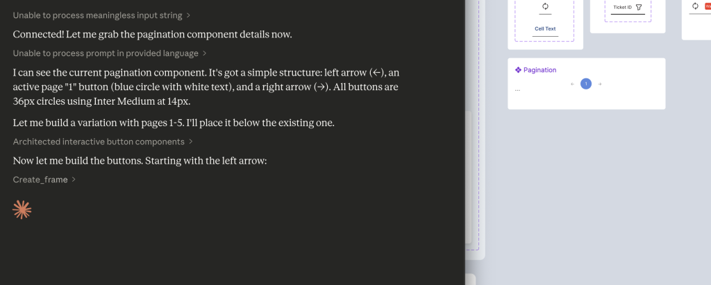
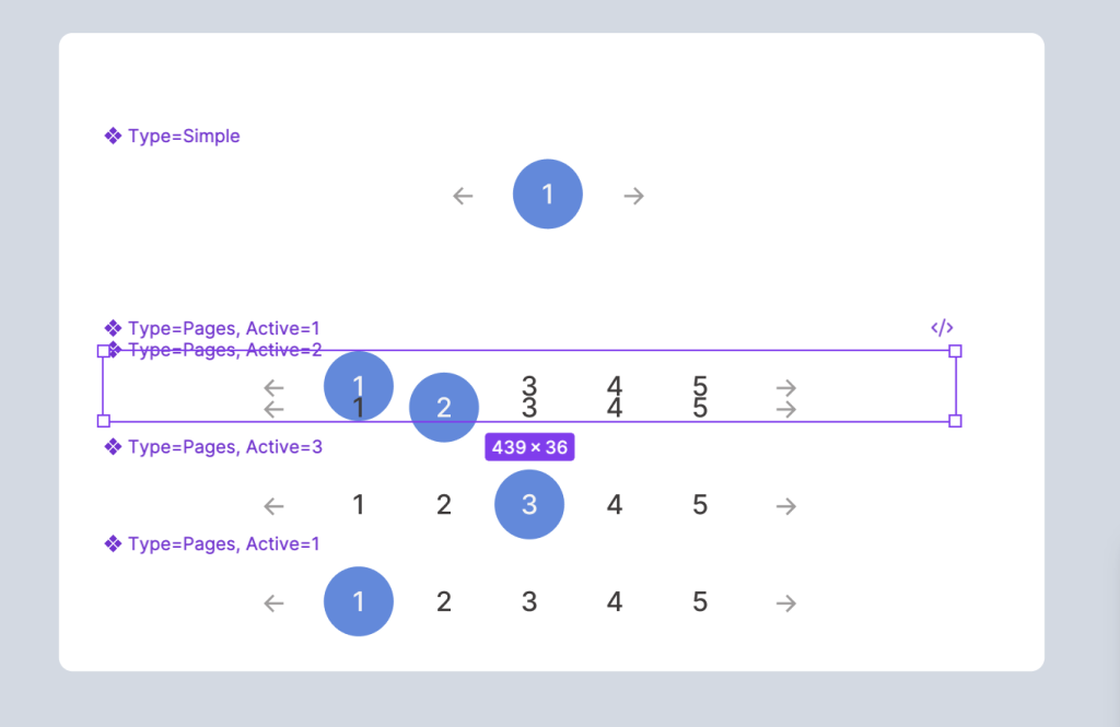
My first real task was ambitious: create a new variant of my pagination component that shows pages 1 through 5, with the ability to set any page as active. This is the kind of repetitive component work that feels like it should be perfect for AI assistance.

It was not perfect.

Yikes…

Claude’s initial approach was to build each page button from scratch, creating a frame, setting the corner radius, applying a fill, configuring auto layout, adding text, and styling it. That’s five or six API calls per button, and the connection kept timing out between operations. The Figma plugin needs to stay in focus, and any time I switched windows or the plugin lost visibility, the WebSocket would drop. I found myself reconnecting and sharing new channel IDs multiple times.

After deleting that first attempt and regrouping, we tried a smarter approach: clone the existing component and modify the clones. This was significantly faster. Instead of 35+ API calls to build from scratch, cloning and updating took roughly 12 to 15 calls. Claude duplicated the pagination, cloned the active page button four times, updated the text and colors on each, and reordered the elements.

But when it came time to combine everything into a Figma component set with proper variants, the result didn’t stick. The API reported success, but the components appeared scattered on the canvas rather than grouped into a variant set with the purple dashed border. This was a gap between what the tool reported and what Figma actually produced.

The pagination exercise taught me the most important lesson of the session: this tool is not a replacement for hands-on design. It’s a power tool for specific types of work.

Where It Started to Click

After the pagination learning curve, I shifted to tasks that played to the MCP’s strengths, and the difference was immediate.

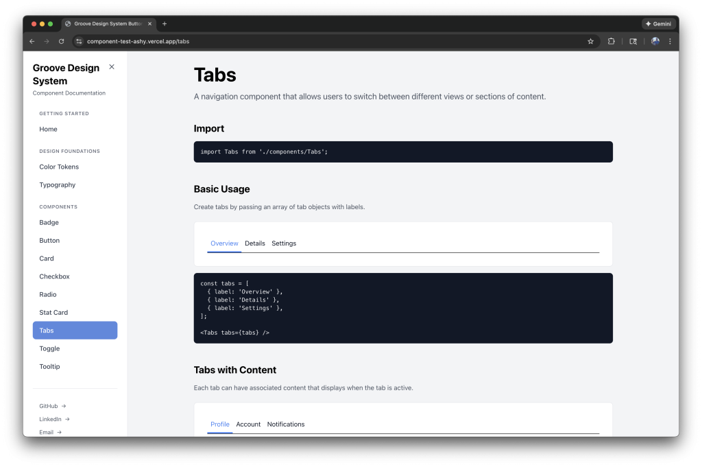
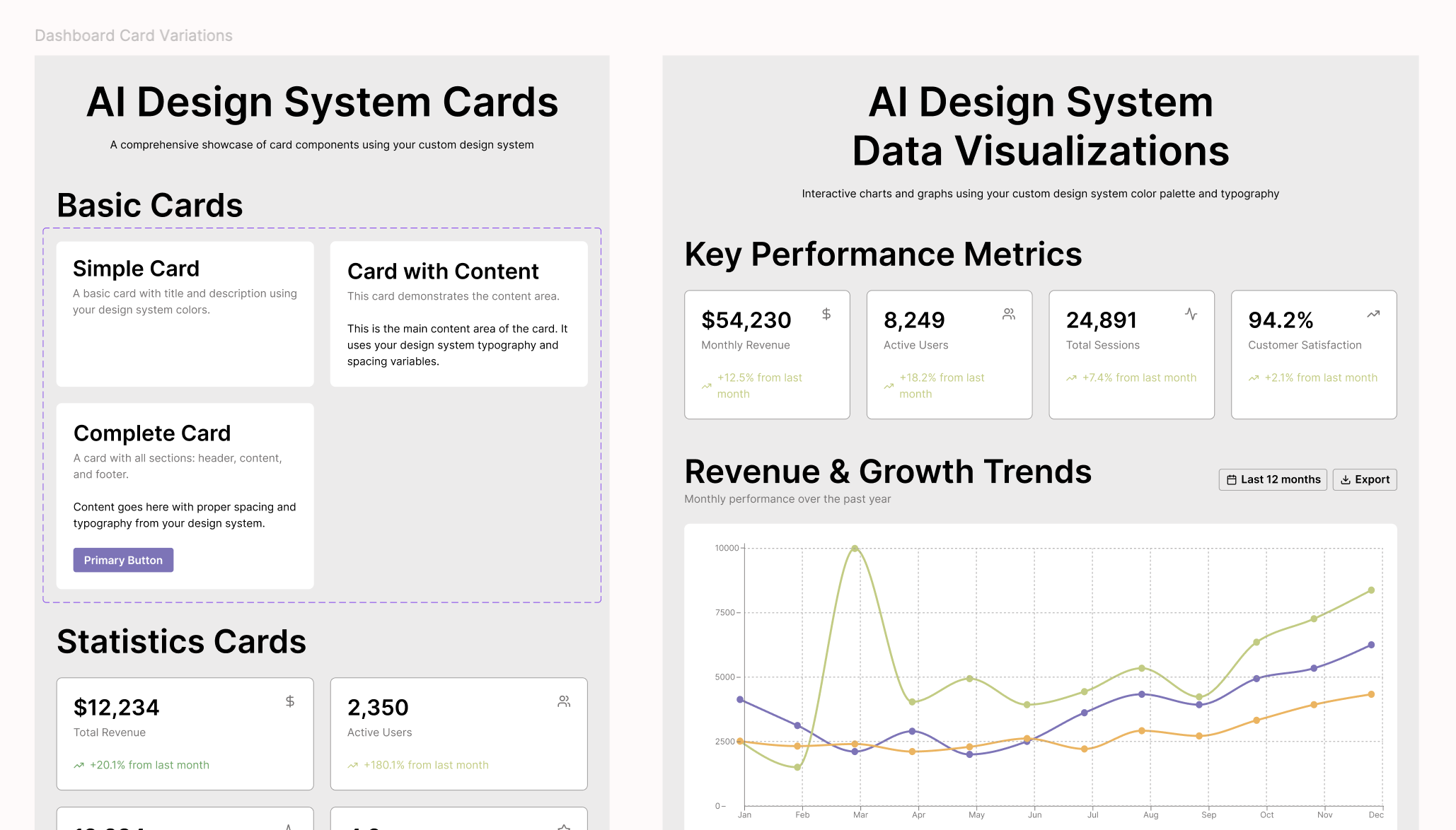
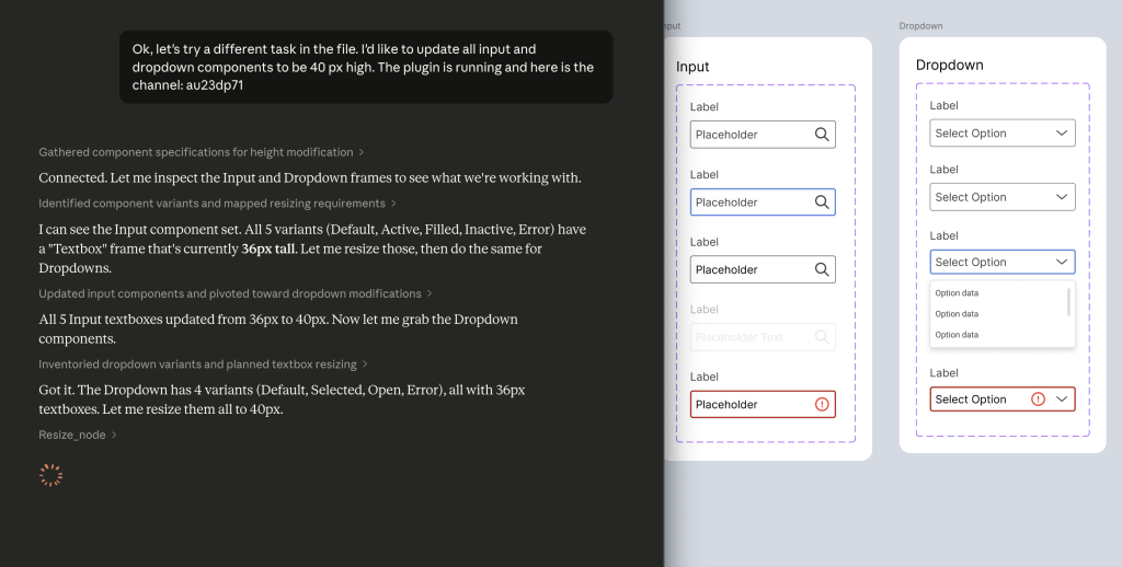
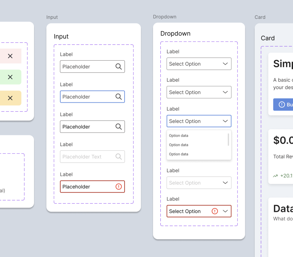
Bulk property updates. I needed to resize all input and dropdown textboxes from 36px to 40px across every variant. Inputs had five variants (Default, Active, Filled, Inactive, Error) and dropdowns had four (Default, Selected, Open, Error). Claude read each component set, identified the textbox frames, and resized all nine of them in about 30 seconds. No missed variants, no inconsistent values. This is the kind of tedious click-through work that eats time in Figma, and Claude handled it cleanly.

Creating a missing variant. My dropdown component was missing a disabled state that my input component already had. I asked Claude to look at the input’s inactive variant, match the colors, and create the equivalent for the dropdown. It cloned the default dropdown variant, updated the stroke to use grayscale/border/disabled and the text to grayscale/text/disabled, renamed it properly, and inserted it into the component set. The whole process took under a minute.

Disabled variant added in the dropdown section.

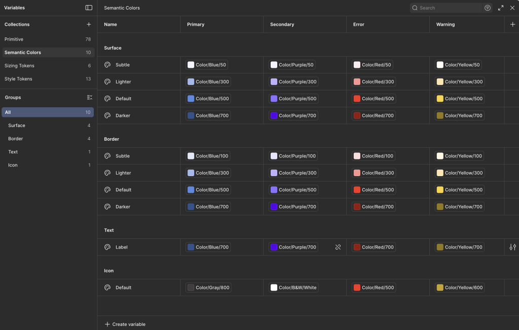
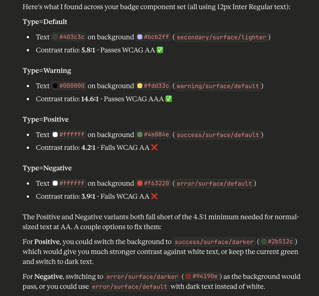
Accessibility auditing. This was the real surprise. I asked Claude to check the contrast ratios on my badge component. It read the text colors and background fills from all four variants (Default, Warning, Positive, Negative), calculated the WCAG contrast ratios, and identified two failures. The Positive badge (white text on success/surface/default at #4e884e) came in at 4.2:1, and the Negative badge (white text on error/surface/default at #f63220) was 3.9:1. Both below the 4.5:1 AA threshold.

Claude recommended switching to the darker token values for each, which I approved, and it updated both backgrounds. The Positive badge jumped to 10.5:1 and the Negative to 7.2:1, both exceeding even the AAA standard. Being able to audit and fix accessibility issues through conversation, referencing my actual token system, felt like a genuine workflow improvement.

Understanding the Limitations

A few things to know if you’re considering this tool for design system work.

Connection stability requires attention. The WebSocket bridge means you need to keep the Figma plugin window visible and the socket server running in your terminal. Switching focus or letting the plugin go to background will cause timeouts. This adds friction, especially during longer sessions.

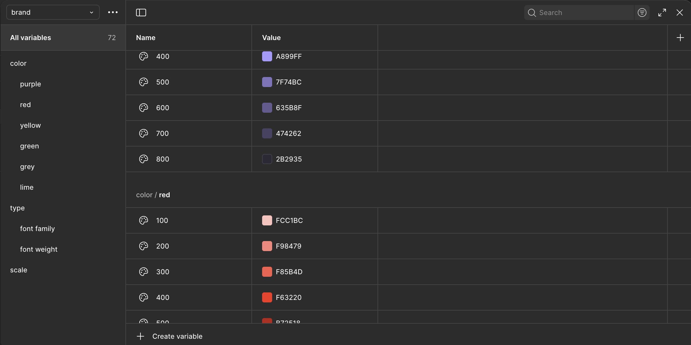
Variables aren’t supported. The MCP can read legacy Figma styles but not the newer Variables system. For my token-driven design system, this meant Claude could apply the correct hex values but couldn’t bind them to variables. The visual result is right, but the variable references need to be manually linked afterward. For production design system work, that’s a real gap.

Building from scratch is slow. Every Figma operation is a separate API call. Creating a simple button takes five or six calls. Creating a complex component with multiple nested elements can take dozens. If you need to build something new, you’re better off doing it yourself in Figma and then using Claude for modifications.

The Sweet Spot

After a full session, the pattern became clear. The Figma MCP is most effective for:

Reading and reporting. Scanning components, extracting color values, auditing text styles, checking dimensions. Claude can analyze a component set faster than you can click through the inspect panel.

Repetitive modifications. Resizing, recoloring, renaming, and updating properties across many variants. The more repetitive the task, the bigger the time savings.

Accessibility checks. Calculating contrast ratios against your actual component colors and suggesting fixes based on your token system. This turned out to be one of the most practical use cases.

Creating variants from existing components. Clone and modify is the right mental model. Give Claude a base component and a list of what needs to change, and it can produce variants efficiently.

The tool is not there yet for complex visual design or building components from the ground up. But for the maintenance, auditing, and bulk-update work that takes up a surprising amount of design system time, it’s a meaningful addition to the workflow. I’ll keep experimenting with it and sharing what I find.

Groove Design System: Building a Component Library with AI

By Rob M.

Taking my AI-assisted workflow experiment further, from a single button to a complete design system.

Groove component documentation page example.
Groove GitHub Repo

I’ve been passionate about design systems for most of my career. There’s something satisfying about building foundations that help teams work faster and more consistently. Lately, I’ve been equally interested in how AI can speed up design workflows, not as a replacement for design thinking, but as a way to handle the repetitive parts of the job.

Last month, I wrote about my first experiment building a web component with Claude. That post covered the process of taking a button design from Figma to a deployed, production-ready React component in about two hours. It was eye-opening, and it left me wondering: what would happen if I scaled that approach to an entire design system?

So I set out to find out. I decided to build a mini design system from scratch with a clear goal: create a documentation site I could share publicly and build a code repository I could pull from for future projects.

The Experiment: Groove Design System

I called it Groove. The concept started as a foundation for a vinyl record tracking application I used as inspiration when trying out Figma Make, but it quickly became a sandbox for testing AI-assisted workflows at a larger scale.

Previous Figma Make dashboard I created with some of the initial components in the Groove system.

The real question I wanted to answer: how much could AI tooling compress the timeline from design to documented, production-ready components across an entire system?

Establishing the Foundations

Before jumping into components, I needed to establish the design foundations that everything else would build on.

For typography, I defined a scale that covers headings, body text, and supporting styles. These decisions inform how every component handles text, from button labels to card descriptions.

For color, I built out a token architecture covering primary, secondary, and neutral palettes, along with semantic colors for success, warning, error, and informational states. Having these tokens in place early meant I could apply them consistently as I built out components, and updating a color later would cascade through the entire system.

Both foundations have dedicated pages in the documentation site, so anyone using the system can reference the available options.

Groove’s token architecture

Building in Figma

I wanted a component set that would be practical for dashboard interfaces, since that’s the direction I saw Groove heading. I landed on 11 components to start.

The Button component covers the essentials: 7 variants, 4 size options, and support for leading and trailing icons. For content containers, I built a flexible Card component with optional headers, descriptions, and footers, adding subtle drop shadows for depth. Badge and StatCard components handle status indicators and dashboard metrics, with StatCard including trend indicators to show movement over time.

For form controls, I created Checkbox, Radio, and Toggle components, each with default, active, and disabled states. Accessibility was a priority here, so I made sure proper ARIA attributes were in place. Tabs provides a horizontal inline layout for switching between content sections, while Tooltip offers contextual help with four positioning options and documented accessibility best practices.

I designed the full component library in Figma, treating it like I would any production system. Every component includes its variants, states, and sizing options laid out for reference.

From Design to Code with AI

This is where things got interesting. Using Claude in VS Code, I translated each Figma component into React with Tailwind CSS. The AI handled a lot of the repetitive work: generating component boilerplate, writing props tables, creating usage examples, and drafting best practice guidelines.

Using Claude directly in VS Code let me quickly generate documentation pages.

What would normally take hours per component took significantly less time. More importantly, the documentation came out consistent across every component, with the same structure, same level of detail, and same patterns throughout.

The documentation for each component includes:

  • Import instructions
  • Live examples showing all variants and states
  • A comprehensive props table
  • Best practice guidelines
  • Usage examples demonstrating real-world integration

The result is a fully functional documentation site with components, the design foundation pages, and a collapsible sidebar navigation organized into “Design Foundations” and “Components” sections.

What I Learned

AI doesn’t replace the design thinking. I still made decisions about token architecture, component API design, variant naming, and how things should behave. But it dramatically reduces the grunt work of translating those decisions into code and documentation.

For design systems teams stretched thin, this kind of workflow could be a real multiplier. The consistency alone is worth it. When every component follows the same documentation pattern, the system feels cohesive and is easier for developers to adopt.

Explore the Work

View the documentation site

View the GitHub repository

Building Web Components with Claude

By Rob M.

As a designer with front-end development experience, I’ve always been interested in the the design to development process. Recently, I experimented with AI as a partner to establish the foundation of my design system with the goal to build my very first component.

The Challenge

For my Figma Make test, I had created a button design with six variants, multiple sizes, icon support, and proper states. The usual workflow? Hand it off to a developer, wait, review, revise, repeat.

This time, I wanted to run an experiement if I could build it myself.

My button design system with custom color palette

The Process

I shared my designs with Claude and created a prompt that expressed I would like to build a react component version of the button. It was quick to give me a full list of required files and the file structure. Within minutes, I had the all the files setup and I was on my way to my first component.

Claude gave me a great overview of file structre and how the code shold look within each of those files.

But it wasn’t just about generating code. When I hit a white screen error on my first run, we debugged together. Checking terminal output, browser console, systematically solving problems. It felt less like using a tool and more like pair programming.

Whoops! Looks like Claude forgot to add the vite config file.

What I Built

What started as “make me some buttons” became a complete project:

  • React component with custom design tokens
  • Unit test for reliability
  • Complete documentation and examples
  • Live deployment on Vercel
  • Open source on GitHub

Total time from design to deployed, production-ready code? About two hours.

Once I had the local instance, I pushed up to GitHub.
Documentation created by Claude.

Once I had my GitHub repo set up, my next step was to create a view on the web to be able to share the output. That is when I asked Claude for recommendations and it pointed me to Vercel.

You can see the output here.

The last thing on my list was to add unit testing for the button. Once I saw that it passed I knew that I had created a production-ready web component.

Lessons Learned

Everything wasn’t smooth. File structures matter. Dependencies are real. Git has a learning curve. But I learned by doing, not by reading documentation for hours. The AI met me where I was and helped me level up incrementally.

The debugging moments taught me more than when things just worked.

What’s Next

This is just the beginning. I’m already working on expanding this into a full design system with inputs, cards, modals, and more complex components. Each new piece helps me understand both design and development better.

The line between design and development is blurring, and I think that’s a good thing—not because designers should replace developers, but because we should understand each other’s worlds better.

Tools Used

  • Design: Figma
  • Development: VS Code
  • AI Partner: Claude
  • Framework: React + Vite
  • Styling: Tailwind CSS
  • Testing: Vitest + React Testing Library
  • Deployment: Vercel
  • Version Control: Git + GitHub (Tower app)

From Tokens to Interactions with Figma Make

By Rob M.

Designers are increasingly adopting AI to speed up their workflows and sharing their experiences across all the popular social platforms. The surge of posts from designers discussing AI tools and techniques shows how quickly the design community is embracing this technology. As a manager, I’m inspired by how my team continually explores its potential to enhance their work.

I’ll admit that I looked at AI as it entered all aspects of product development with a bit of skepticism. But the more I see it implemented within different aspects of the product lifecycle, the more encouraged and intrigued I become.

As someone who loves building and creating better ways to approach problem-solving, I decided to try my hand at seeing what I could do with Figma Make.

Goal: Create a mini design system in Figma, establishing a token architecture to enable Figma Make to develop a dashboard.

Starting with a Game Plan

My first step was to ask Claude what I should focus on for this project.

Claude’s response:

Great! Now I had a reference point to keep me focused on building out my system. With that, I began setting up my token architecture.

Building the Token Architecture

With a basic token architecture in place, I began designing components in my Figma file. Then I had a thought. If I have all my styles defined, can I use Figma Make to build the necessary design components?

The Answer: Yes-ish

Generating Components with Figma Make

I connected my mini token set and asked it to create a set of buttons. Out of the box, it was an excellent start. I had variations in size and type that I would expect from a system.

What’s great about Figma Make is that I could take these buttons and migrate them directly into Figma.

Once in Figma, I took the copied elements and applied all the properties to create my variants. Although there might be a faster way to do this, my first attempt didn’t reveal any shortcuts. Still, it was pretty straightforward to create variants from the elements.

Expanding the Component Library

Next, I worked with Make to develop cards and data visualizations for my dashboard concept, all following my token architecture.

With the other elements in place, I pulled together the dashboard navigation and container.

Assembling the Dashboard

After completing all the individual pieces, I went ahead and laid out my dashboard. I even used an AI feature in Figma to generate some content as a placeholder. Because of my background as a musician, I used the concept of a vinyl pressing plant as a source of inspiration for my content.

Bringing It to Life with Interactions

During this process, I had a lot of “this is cool” moments. However, it was this last part that took my expectations to the next level. Once I had constructed the dashboard, it was time to bring everything together in Make.

I provided the prompt that I wanted the dashboard to have interactions, be responsive, and have the navigation drawer open and close.

The output was amazing, with all interactions in place. The dashboard was responsive, with some nice easing on resize. The navigation had hover styles, and it opened and closed as expected. The visualizations even had tooltips showing data on hover. In the course of a few hours, I had a fully functioning coded prototype.

You can interact with the output here.

Under the Hood

Under the hood, the code looked ok. It’s using React, and I was able to see the structure of the components, which helped me understand what is being used. Was this production-ready code? Not yet, but I am hopeful that we are not far off from a more streamlined design to dev hand-off. For now, it’s a really nice interactive prototype to test.

Final Thoughts

Looking back at this experiment, I’m genuinely impressed by what’s possible when you combine thoughtful design systems work with AI tools like Figma Make. What started as skepticism has turned into curiosity about how these tools can fit into our workflows. The key takeaway for me? AI isn’t replacing the design process—it’s accelerating the parts that used to take hours of repetitive work, letting us spend more time on the creative problem-solving we love. If you’ve been hesitant to explore AI in your design workflow, I’d encourage you to pick a small project and just experiment. You might surprise yourself with what you can build in an afternoon.