
Taking my AI-assisted workflow experiment further, from a single button to a complete design system.
I’ve been passionate about design systems for most of my career. There’s something satisfying about building foundations that help teams work faster and more consistently. Lately, I’ve been equally interested in how AI can speed up design workflows, not as a replacement for design thinking, but as a way to handle the repetitive parts of the job.
Last month, I wrote about my first experiment building a web component with Claude. That post covered the process of taking a button design from Figma to a deployed, production-ready React component in about two hours. It was eye-opening, and it left me wondering: what would happen if I scaled that approach to an entire design system?
So I set out to find out. I decided to build a mini design system from scratch with a clear goal: create a documentation site I could share publicly and build a code repository I could pull from for future projects.
The Experiment: Groove Design System
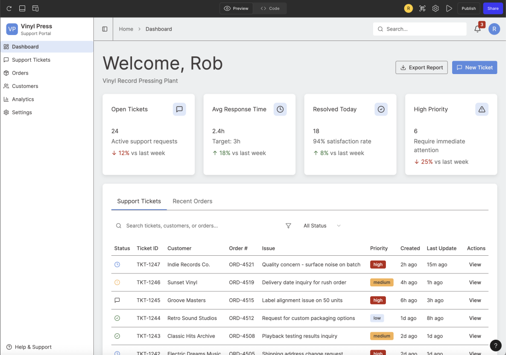
I called it Groove. The concept started as a foundation for a vinyl record tracking application I used as inspiration when trying out Figma Make, but it quickly became a sandbox for testing AI-assisted workflows at a larger scale.
The real question I wanted to answer: how much could AI tooling compress the timeline from design to documented, production-ready components across an entire system?
Establishing the Foundations
Before jumping into components, I needed to establish the design foundations that everything else would build on.
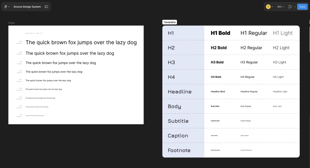
For typography, I defined a scale that covers headings, body text, and supporting styles. These decisions inform how every component handles text, from button labels to card descriptions.
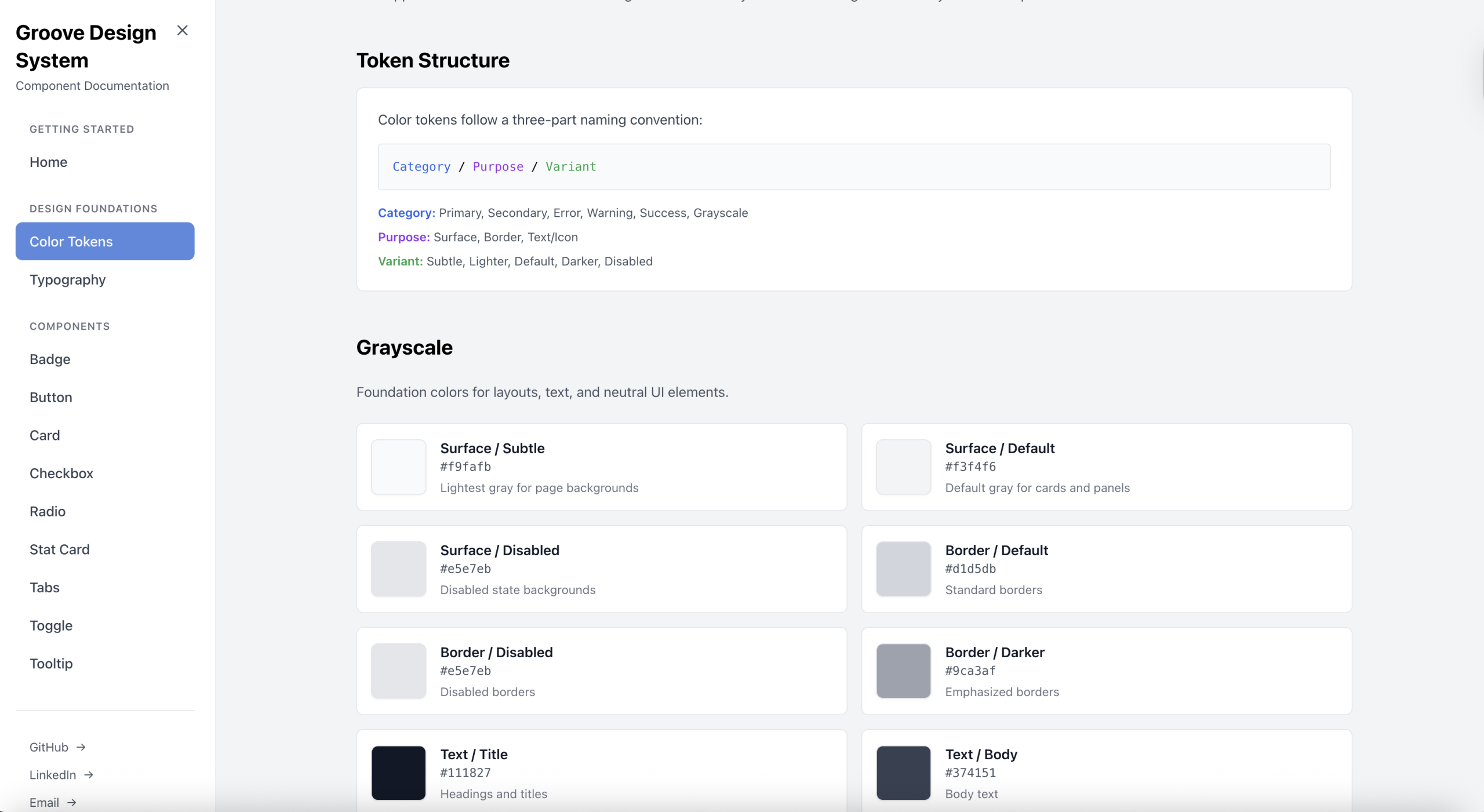
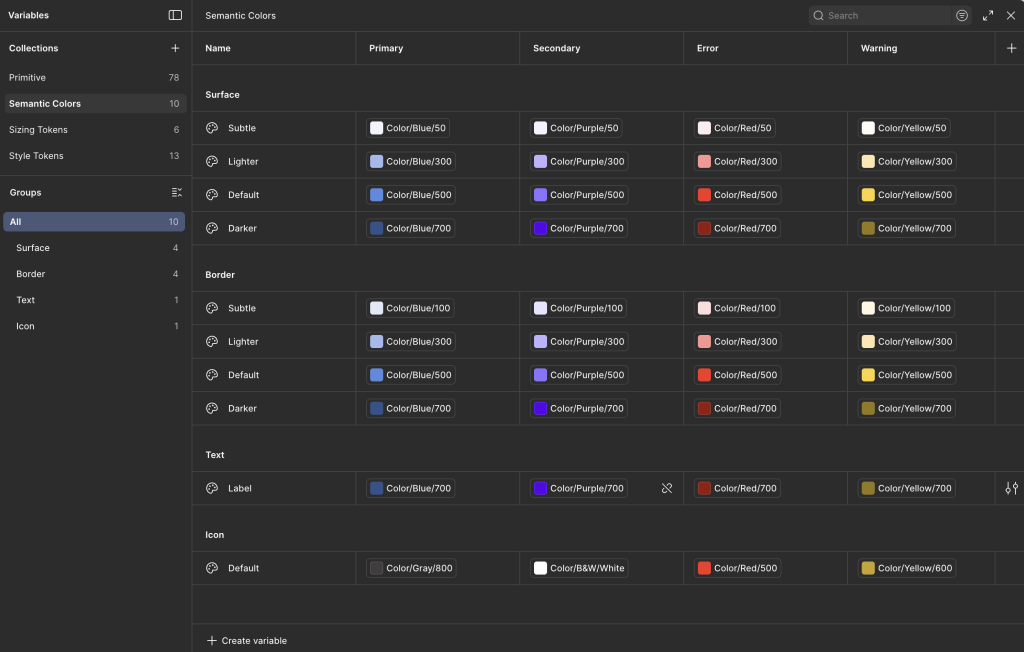
For color, I built out a token architecture covering primary, secondary, and neutral palettes, along with semantic colors for success, warning, error, and informational states. Having these tokens in place early meant I could apply them consistently as I built out components, and updating a color later would cascade through the entire system.
Both foundations have dedicated pages in the documentation site, so anyone using the system can reference the available options.
Building in Figma
I wanted a component set that would be practical for dashboard interfaces, since that’s the direction I saw Groove heading. I landed on 11 components to start.
The Button component covers the essentials: 7 variants, 4 size options, and support for leading and trailing icons. For content containers, I built a flexible Card component with optional headers, descriptions, and footers, adding subtle drop shadows for depth. Badge and StatCard components handle status indicators and dashboard metrics, with StatCard including trend indicators to show movement over time.
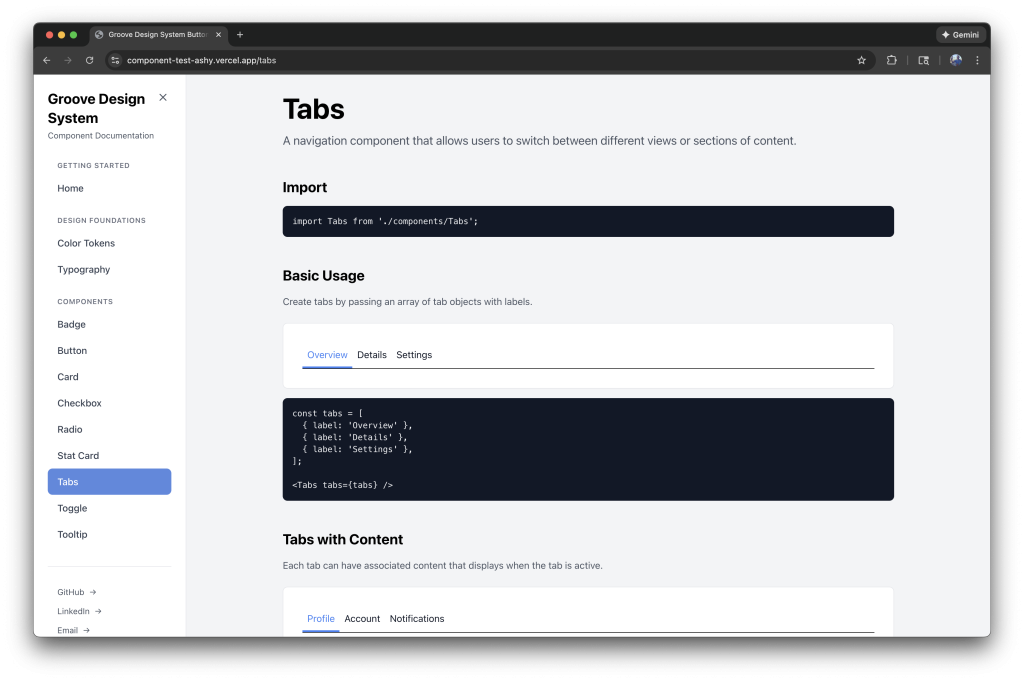
For form controls, I created Checkbox, Radio, and Toggle components, each with default, active, and disabled states. Accessibility was a priority here, so I made sure proper ARIA attributes were in place. Tabs provides a horizontal inline layout for switching between content sections, while Tooltip offers contextual help with four positioning options and documented accessibility best practices.
I designed the full component library in Figma, treating it like I would any production system. Every component includes its variants, states, and sizing options laid out for reference.
From Design to Code with AI
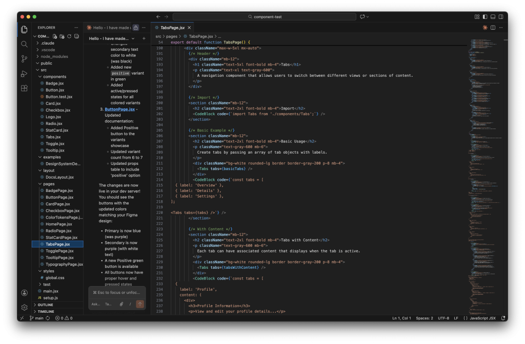
This is where things got interesting. Using Claude in VS Code, I translated each Figma component into React with Tailwind CSS. The AI handled a lot of the repetitive work: generating component boilerplate, writing props tables, creating usage examples, and drafting best practice guidelines.
What would normally take hours per component took significantly less time. More importantly, the documentation came out consistent across every component, with the same structure, same level of detail, and same patterns throughout.
The documentation for each component includes:
- Import instructions
- Live examples showing all variants and states
- A comprehensive props table
- Best practice guidelines
- Usage examples demonstrating real-world integration
The result is a fully functional documentation site with components, the design foundation pages, and a collapsible sidebar navigation organized into “Design Foundations” and “Components” sections.
What I Learned
AI doesn’t replace the design thinking. I still made decisions about token architecture, component API design, variant naming, and how things should behave. But it dramatically reduces the grunt work of translating those decisions into code and documentation.
For design systems teams stretched thin, this kind of workflow could be a real multiplier. The consistency alone is worth it. When every component follows the same documentation pattern, the system feels cohesive and is easier for developers to adopt.