
As a designer with front-end development experience, I’ve always been interested in the the design to development process. Recently, I experimented with AI as a partner to establish the foundation of my design system with the goal to build my very first component.
The Challenge
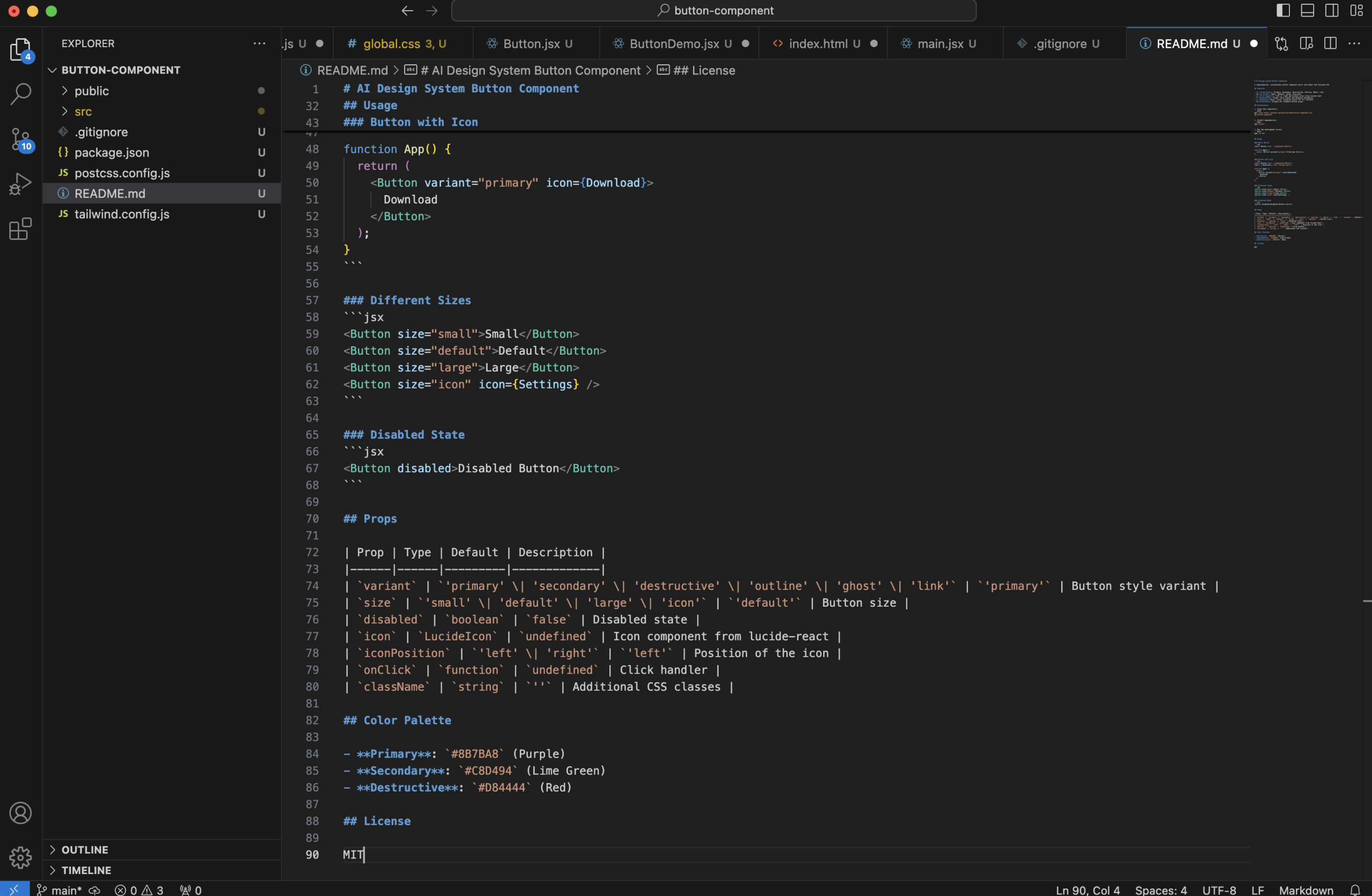
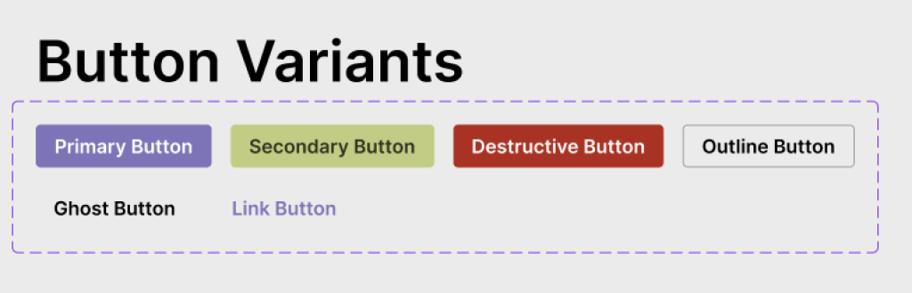
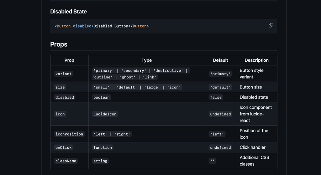
For my Figma Make test, I had created a button design with six variants, multiple sizes, icon support, and proper states. The usual workflow? Hand it off to a developer, wait, review, revise, repeat.
This time, I wanted to run an experiement if I could build it myself.
The Process
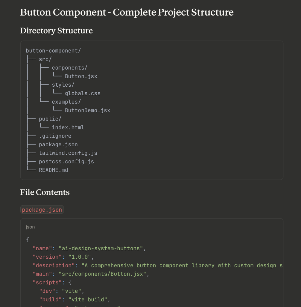
I shared my designs with Claude and created a prompt that expressed I would like to build a react component version of the button. It was quick to give me a full list of required files and the file structure. Within minutes, I had the all the files setup and I was on my way to my first component.
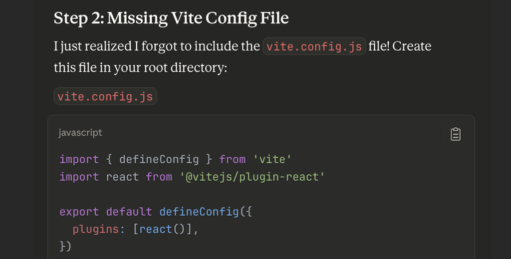
But it wasn’t just about generating code. When I hit a white screen error on my first run, we debugged together. Checking terminal output, browser console, systematically solving problems. It felt less like using a tool and more like pair programming.
What I Built
What started as “make me some buttons” became a complete project:
- React component with custom design tokens
- Unit test for reliability
- Complete documentation and examples
- Live deployment on Vercel
- Open source on GitHub
Total time from design to deployed, production-ready code? About two hours.
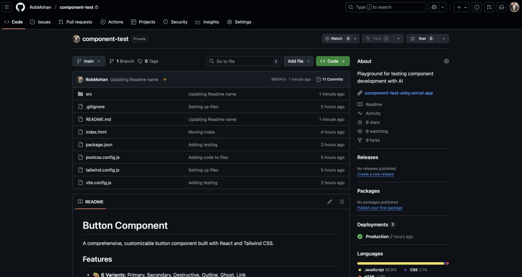
Once I had my GitHub repo set up, my next step was to create a view on the web to be able to share the output. That is when I asked Claude for recommendations and it pointed me to Vercel.
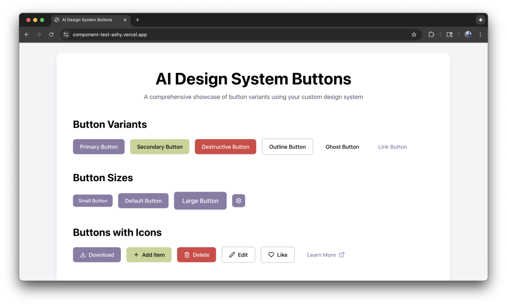
You can see the output here.
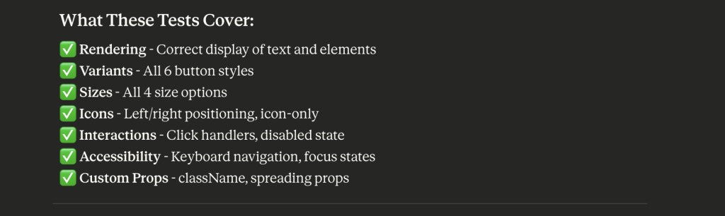
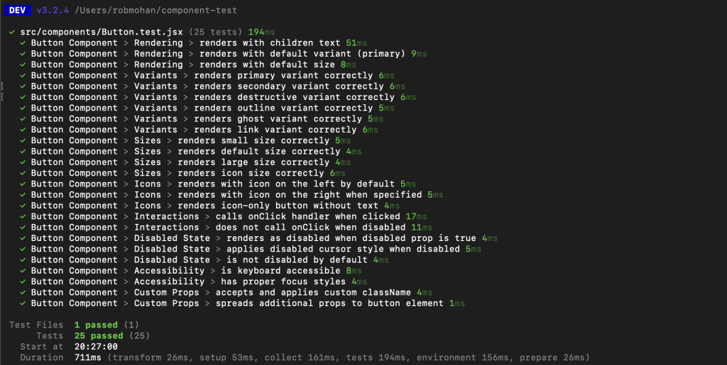
The last thing on my list was to add unit testing for the button. Once I saw that it passed I knew that I had created a production-ready web component.
Lessons Learned
Everything wasn’t smooth. File structures matter. Dependencies are real. Git has a learning curve. But I learned by doing, not by reading documentation for hours. The AI met me where I was and helped me level up incrementally.
The debugging moments taught me more than when things just worked.
What’s Next
This is just the beginning. I’m already working on expanding this into a full design system with inputs, cards, modals, and more complex components. Each new piece helps me understand both design and development better.
The line between design and development is blurring, and I think that’s a good thing—not because designers should replace developers, but because we should understand each other’s worlds better.
Tools Used
- Design: Figma
- Development: VS Code
- AI Partner: Claude
- Framework: React + Vite
- Styling: Tailwind CSS
- Testing: Vitest + React Testing Library
- Deployment: Vercel
- Version Control: Git + GitHub (Tower app)